Pure Gym Redesign
Description
Redesigned the PureGym app to improve navigation, hierarchy, and overall usability.
Design Principle
Applied Apple's Human Interface Guidelines across the design system.
Approach
Started with a UX audit to identify and address key usability issues before visual design.
Home Screen
BEFORE


No dark mode available
AFTER

Dark
Light
Design Decisions
Introduced navigation: Added a tab bar to replace the previous tile-heavy home screen and provide clearer access to key sections.
Simplified: Reduced the home screen from a carousel, 8 tiles, and 4 list items to a single hero card and 4 tiles.
Restructured: Moved Buddies and Trophies from the Home Screen to the Profile section to group related content more logically.
Statistics Screen
BEFORE


No dark mode available
AFTER


Dark
Light
Design Decisions
Made data visible: Replaced single screen numbers with charts and data visible at a glance.
Improved readability: Gave each metric its own visual format for easier comparison (Gym Visits, Calories, Highlights).
Simplified time ranges: Replaced the time-range controls with a dropdown for day, week, month, and year.
Location Screen
BEFORE
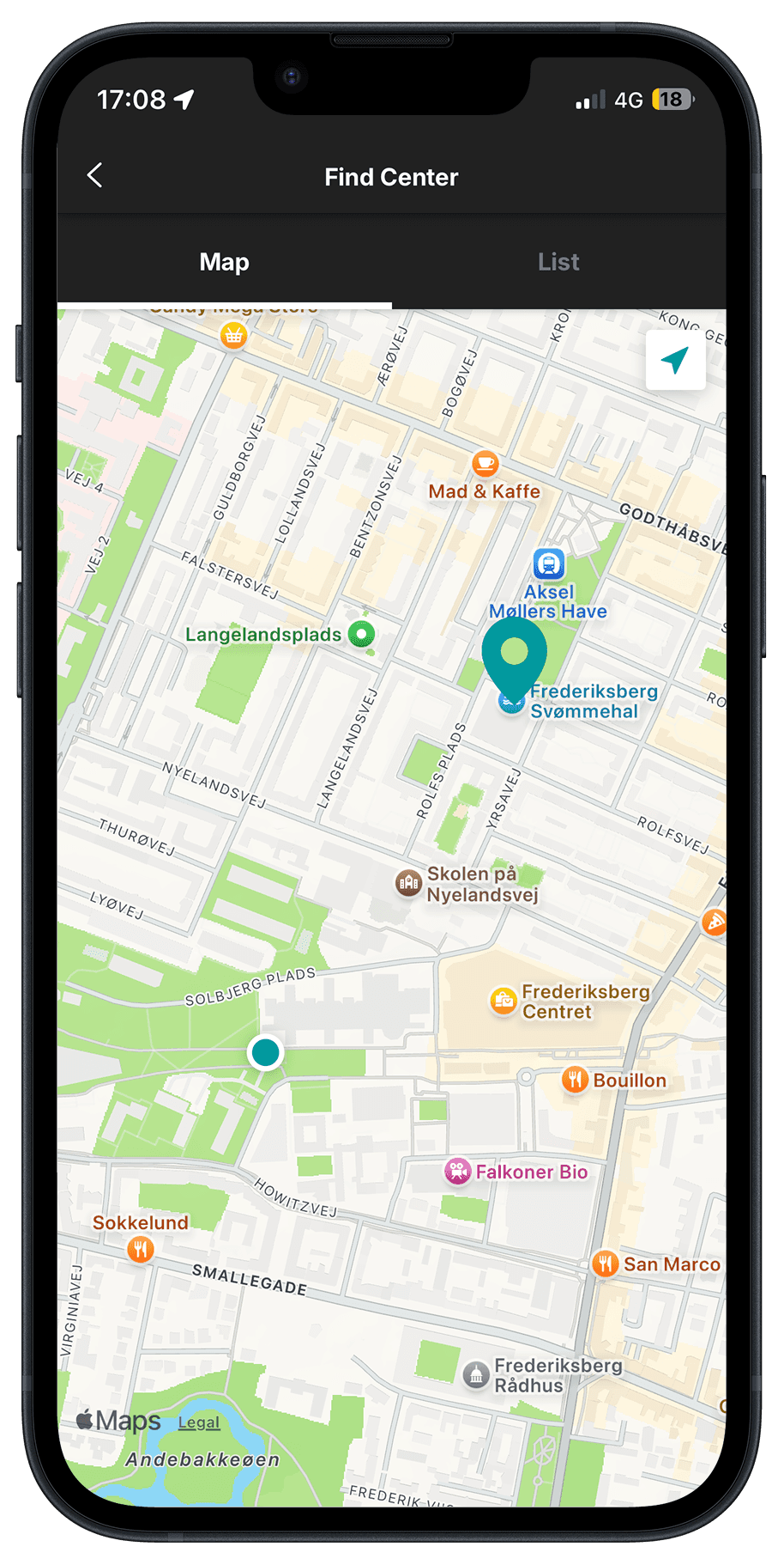

No dark mode available
AFTER


Dark
Light
Design Decisions
Elevated location: Moved Location from the Home screen to a dedicated tab bar slot for easier access.
Redesigned: Reworked the Location screen following Apple’s HIG principles.
Simplified header: Moved the title to the left and added a search icon to the top-right corner.
Profile Screen
BEFORE


No dark mode available
AFTER

Dark
Light
Design Decisions
Restructured: Reworked the Profile from a custom dark header into grouped lists.
Organised: Grouped sections into scannable lists.
Centralised: Moved Trophies and Buddies from the Home screen into Profile alongside Bodytracker.
Explore More


Biblioteket Redesign


Client Apps
JOSIPB © 2026.
Pure Gym Redesign
Description
Redesigned the PureGym app to improve navigation, hierarchy, and overall usability.
Design Principle
Applied Apple's Human Interface Guidelines across the design system.
Approach
Started with a UX audit to identify and address key usability issues before visual design.
Home Screen
BEFORE
No dark mode available
AFTER
Dark
Light
Design Decisions
•
Introduced navigation: Added a tab bar to replace the previous tile-heavy home screen and provide clearer access to key sections.
•
Simplified: Reduced the home screen from a carousel, 8 tiles, and 4 list items to a single hero card and 4 tiles.
•
Restructured: Moved Buddies and Trophies from the Home Screen to the Profile section to group related content more logically.
Statistics Screen
BEFORE
No dark mode available
AFTER
Dark
Light
Design Decisions
•
Made data visible: Replaced single screen numbers with charts and data visible at a glance.
•
Improved readability: Gave each metric its own visual format for easier comparison (Gym Visits, Calories, Highlights).
•
Simplified time ranges: Replaced the time-range controls with a dropdown for day, week, month, and year.
Location Screen
BEFORE
No dark mode available
AFTER
Dark
Light
Design Decisions
•
Elevated location: Moved Location from the Home screen to a dedicated tab bar slot for
easier access.
•
Redesigned: Reworked the Location screen following Apple’s HIG principles.
•
Simplified header: Moved the title to the left and added a search icon to the top-right corner.
Profile Screen
BEFORE
No dark mode available
AFTER
Dark
Light
Design Decisions
•
Restructured: Reworked the Profile from a custom dark header into grouped lists.
•
Organised: Grouped sections into scannable lists.
•
Centralised: Moved Trophies and Buddies from the Home screen into Profile alongside Bodytracker.
Explore More
Biblioteket Redesign

Client Apps
JOSIPB © 2026.
Pure Gym Redesign
Description
Redesigned the PureGym app to improve navigation, hierarchy, and overall usability.
Design Principle
Applied Apple's Human Interface Guidelines across the design system.
Approach
Started with a UX audit to identify and address key usability issues before visual design.
Home Screen
BEFORE
No dark mode available
AFTER
Dark
Light
Design Decisions
•
Introduced navigation: Added a tab bar to replace the previous tile-heavy home screen and provide clearer access to key sections.
•
Simplified: Reduced the home screen from a carousel, 8 tiles, and 4 list items to a single hero card and 4 tiles.
•
Restructured: Moved Buddies and Trophies from the Home Screen to the Profile section to group related content more logically.
Statistics Screen
BEFORE
No dark mode available
AFTER
Dark
Light
Design Decisions
•
Made data visible: Replaced single screen numbers with charts and data visible at a glance.
•
Improved readability: Gave each metric its own visual format for easier comparison (Gym Visits, Calories, Highlights).
•
Simplified time ranges: Replaced the time-range controls with a dropdown for day, week, month, and year.
Location Screen
BEFORE
No dark mode available
AFTER
Dark
Light
Design Decisions
•
Elevated location: Moved Location from the Home screen to a dedicated tab bar slot for easier access.
•
Redesigned: Reworked the Location screen following Apple’s HIG principles.
•
Simplified header: Moved the title to the left and added a search icon to the top-right corner.
Profile Screen
BEFORE
No dark mode available
AFTER
Dark
Light
Design Decisions
•
Restructured: Reworked the Profile from a custom dark header into grouped lists.
•
Organised: Grouped sections into scannable lists.
•
Centralised: Moved Trophies and Buddies from the Home screen into Profile alongside Bodytracker.
Explore More


Pure Gym Redesign


Client Apps
JOSIPB © 2026.