Biblioteket Redesign
Description
Biblioteket is a Danish app for discovering books, events, and local library services.
Design Principle
Applied Apple's Human Interface Guidelines across the design system.
Approach
Started with a UX audit to identify and address key usability issues before visual design.
Home Screen
BEFORE


No dark mode available
AFTER


Dark
Light
Design Decisions
Repositioned: Moved Search from the top of the screen to the tab bar for easier access.
Corrected: Adjusted title hierarchy with the right font sizes.
Simplified: Reduced the number of sections to avoid an overly long scroll.
Created: Introduced a distinct layout for the Popular section to make it visually distinct from the rest.
Book Screen
BEFORE


No dark mode available
AFTER


Dark
Light
Design Decisions
Repositioned: Moved “Reserver” and “Føj til huskeliste” (Add to wishlist) from below the cover image to a persistent floating bar at the bottom.
Simplified: Removed the “Find materiale” button, as availability is shown when starting a reservation.
Restructured: Presented book information as scannable lists instead of plain text.
Event Screen
BEFORE


No dark mode available
AFTER

Dark
Light
Design Decisions
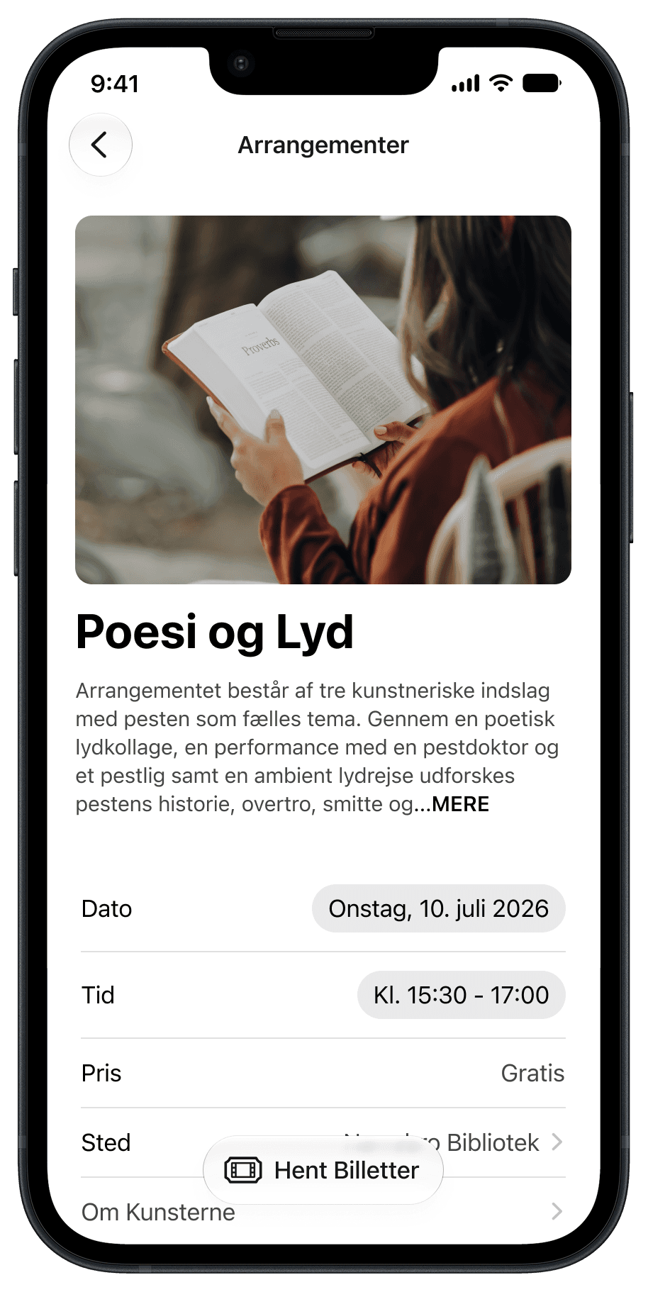
Improved hierarchy: Increased the event image and title size and refined the typography for clearer emphasis.
Added: “Hent Billetter” (Get Tickets) button to a persistent floating bar at the bottom.
Restructured: Presented event information as scannable lists instead of plain text.
Search Screen
BEFORE


No dark mode available
AFTER


Dark
Light
Design Decisions
Repositioned: Moved the search bar from the top to the bottom for easier access while browsing.
Expanded: Browse expanded beyond genres to include curated categories.
Added: Filter controls to the book results page for easier sorting and narrowing without leaving the screen.
Filter Screen
BEFORE


No dark mode available
AFTER


Dark
Light
Design Decisions
Repositioned: Moved filters from a full-screen modal to a dropdown in the top toolbar.
Simplified: Grouped and collapsed search options, allowing users to expand only the category they need.
Removed: Eliminated the unnecessary “Anvend” (Confirm) button from the search flow.
Explore More


Pure Gym Redesign


Client Apps
JOSIPB © 2026.
Biblioteket Redesign
Description
Biblioteket is a Danish app for discovering books, events, and local library services.
Design Principle
Applied Apple's Human Interface Guidelines across the design system.
Approach
Started with a UX audit to identify and address key usability issues before visual design.
Home Screen
BEFORE
No dark mode available
AFTER
Dark
Light
Design Decisions
•
Repositioned: Moved Search from the top of the screen to the tab bar for easier access.
•
Corrected: Adjusted title hierarchy with the right font sizes.
•
Simplified: Reduced the number of sections to avoid an overly long scroll.
•
Created: Introduced a distinct layout for the Popular section to make it visually distinct from
the rest.
Book Screen
BEFORE
No dark mode available
AFTER
Dark
Light
Design Decisions
•
Repositioned: Moved “Reserver” and “Føj til huskeliste” (Add to wishlist) from below the cover image to a persistent floating bar at the bottom.
•
Simplified: Removed the “Find materiale” button, as availability is shown when starting a reservation.
•
Restructured: Presented book information as scannable lists instead of plain text.
Event Screen
BEFORE
No dark mode available
AFTER
Dark
Light
Design Decisions
•
Improved hierarchy: Increased the event image and title size and refined the typography for clearer emphasis.
•
Added: “Hent Billetter” (Get Tickets) button to a persistent floating bar at the bottom.
•
Restructured: Presented event information as scannable lists instead of plain text.
Search Screen
BEFORE
No dark mode available
AFTER
Dark
Light
Design Decisions
•
Repositioned: Moved the search bar from the top to the bottom for easier access while browsing.
•
Expanded: Browse expanded beyond genres to include curated categories.
•
Added: Filter controls to the book results page for easier sorting and narrowing without leaving the screen.
Filter Screen
BEFORE
No dark mode available
AFTER
Dark
Light
Design Decisions
•
Repositioned: Moved filters from a full-screen modal to a dropdown in the top toolbar.
•
Simplified: Grouped and collapsed search options, allowing users to expand only the category they need.
•
Removed: Eliminated the unnecessary “Anvend” (Confirm) button from the search flow.
Explore More
Biblioteket Redesign

Client Apps
JOSIPB © 2026.
Biblioteket Redesign
Description
Biblioteket is a Danish app for discovering books, events, and local library services.
Design Principle
Applied Apple's Human Interface Guidelines across the design system.
Approach
Started with a UX audit to identify and address key usability issues before visual design.
Home Screen
BEFORE
No dark mode available
AFTER
Dark
Light
Design Decisions
•
Introduced navigation: Added a tab bar to replace the previous tile-heavy home screen and provide clearer access to key sections.
•
Simplified: Reduced the home screen from a carousel, 8 tiles, and 4 list items to a single hero card and 4 tiles.
•
Restructured: Moved Buddies and Trophies from the Home Screen to the Profile section to group related content more logically.
Book Screen
BEFORE
No dark mode available
AFTER
Dark
Light
Design Decisions
•
Made data visible: Replaced single screen numbers with charts and data visible at a glance.
•
Improved readability: Gave each metric its own visual format for easier comparison (Gym Visits, Calories, Highlights).
•
Simplified time ranges: Replaced the time-range controls with a dropdown for day, week, month, and year.
Event Screen
BEFORE
No dark mode available
AFTER
Dark
Light
Design Decisions
•
Elevated location: Moved Location from the Home screen to a dedicated tab bar slot for easier access.
•
Redesigned: Reworked the Location screen following Apple’s HIG principles.
•
Simplified header: Moved the title to the left and added a search icon to the top-right corner.
Search Screen
BEFORE
No dark mode available
AFTER
Dark
Light
Design Decisions
•
Restructured: Reworked the Profile from a custom dark header into grouped lists.
•
Organised: Grouped sections into scannable lists.
•
Centralised: Moved Trophies and Buddies from the Home screen into Profile alongside Bodytracker.
Filter Screen
BEFORE
No dark mode available
AFTER
Dark
Light
Design Decisions
•
Restructured: Reworked the Profile from a custom dark header into grouped lists.
•
Organised: Grouped sections into scannable lists.
•
Centralised: Moved Trophies and Buddies from the Home screen into Profile alongside Bodytracker.
Explore More
Pure Gym Redesign


Client Apps
JOSIPB © 2026.